Several hurricane seasons ago, I wrote a letter to the editor of The Proceedings of the National Academy of Sciences, one of the most prestigious journals among academic researchers. Even submitting a letter (this one was a rebuttal of a particularly egregious example of junk science that I’ve blogged about before)was an arduous task; it required submission of an academic and professional C.V. which I completed honestly. (I have a B.S. in engineering and I told them I was “Chief of the Operations Directorate” at my company. I was entitled to a little fun, after all.)
So my letter to the editor as published.
Ever since, I occasionally receive email solicitations from various journals to submit papers for “peer-reviewed” publication. Most of them seem to be from third-world countries, but they always have a prestigious-sounding title. The subject matter of these journals ranges from statistics (a topic relevant to my letter) to gynecology (thanks for your consideration …).
They are always addressed to “Dr. Maley”. The most recent example is below.
Dear Dr. Maley Steve,
Greetings! JSM Environmental Science & Ecology is gathering research exploring new frontiers of Environmental Science, exploring investigative areas of basic science to complex Ecology.
Why we reached you?
One of our previous authors recommended your important work entitled on Statistics show no evidence of gender bias in the public’s hurricane preparedness and thus we request your similar important study for publishing to the journal.
Why us?
· Global reach-out
· Research visibility through our social platforms
· Research Specific Campaigns of your published work-Improving your citations is our basic priority
· High Profile Subject Experts
· Stringent Peer Review Process
We invite unique significant work for peer review those are patient centered, share and disseminate knowledge to patients and other stakeholders, and train future leaders of our field.
Current Issue Focus: Environmental Disasters
Closing date: September 10, 2020
We hope that you will join us in our journey to disseminate research in Environment related topics diagnostic tools and treatments, and to answer fundamental questions about Ecology.
Looking forward hearing your valuable response.
Best regards,
Ricky Martin
Editorial Manager– JSM Environmental Science & Ecology
[No discussion of the cost, but it’s usually a few hundred bucks. Ed.]


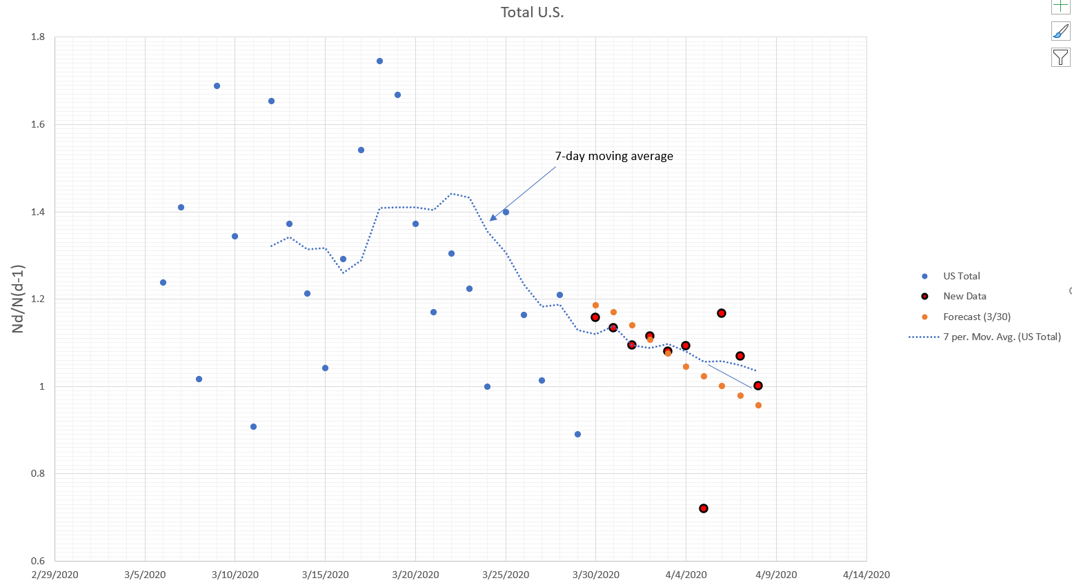
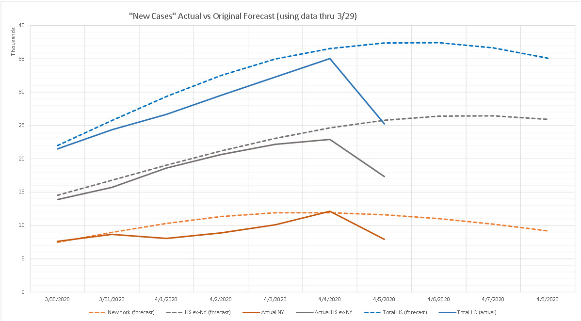


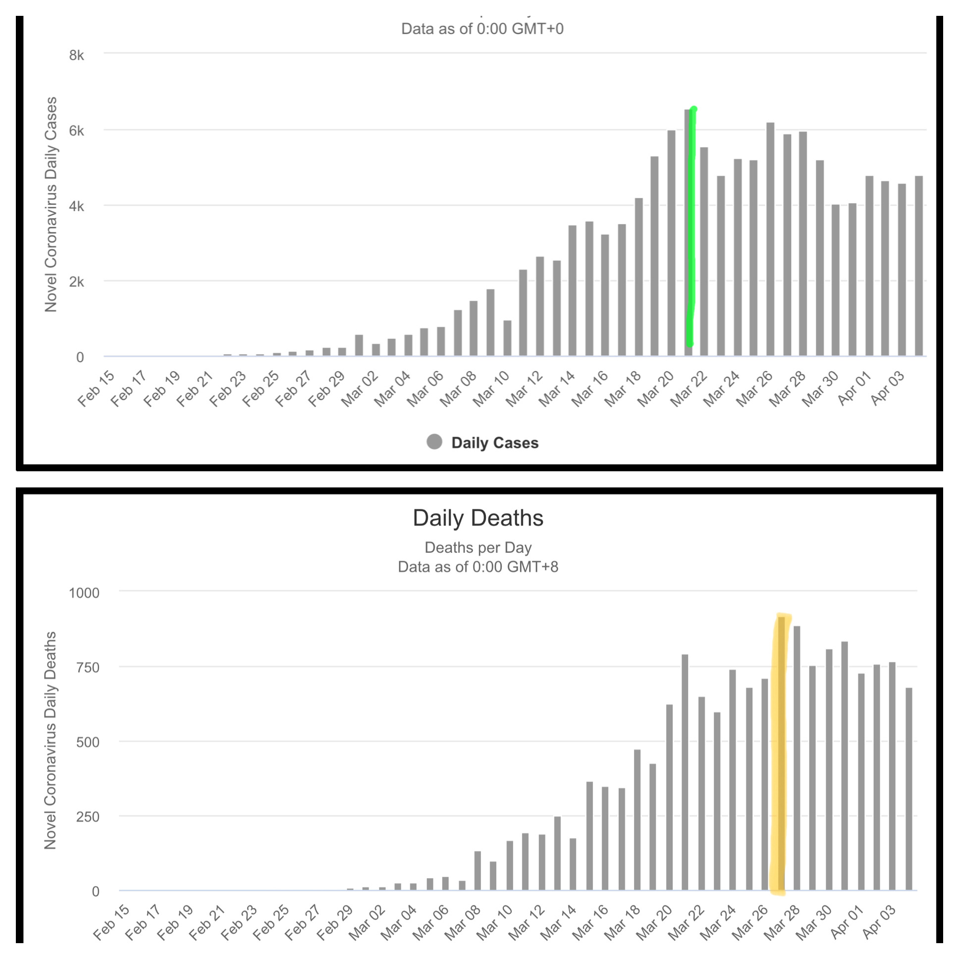
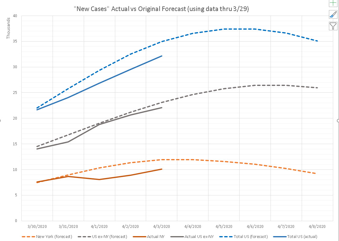
 Curves are generally tracking below my original estimates but may peak April 8 or 9. Click to enlarge.
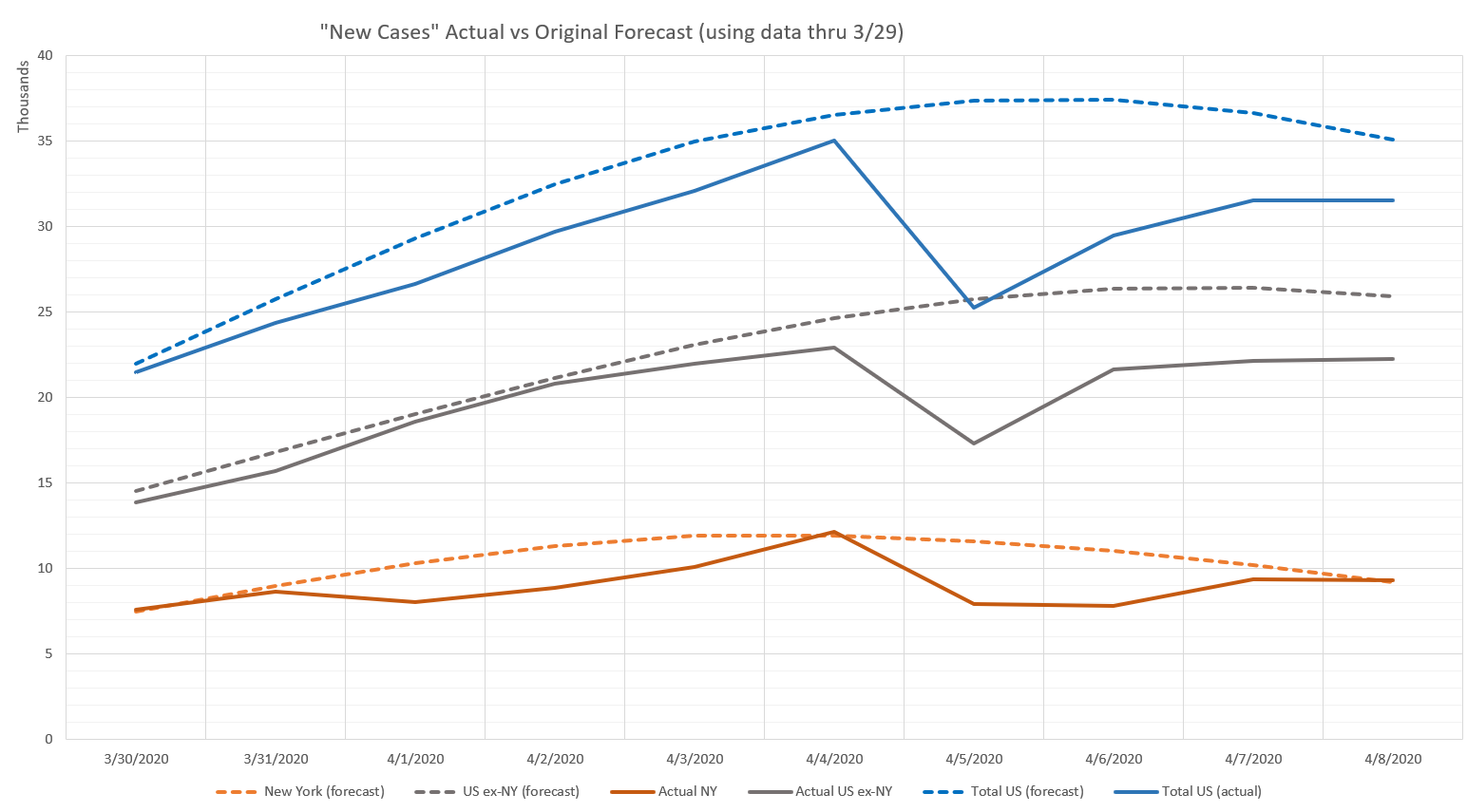
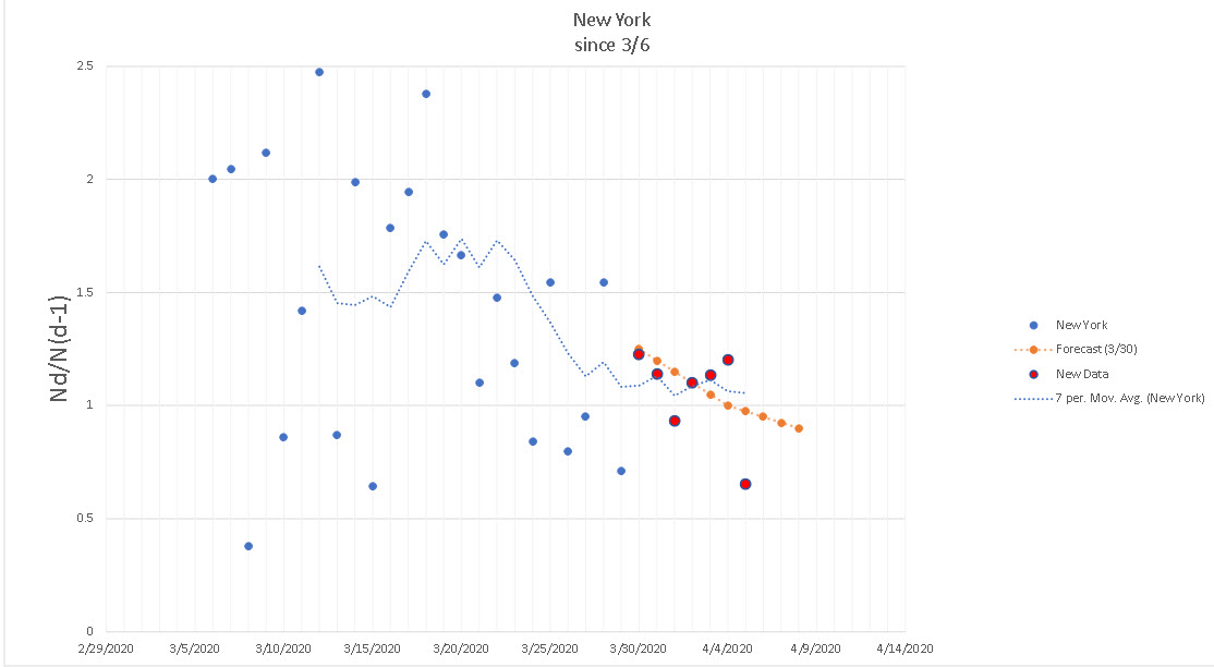