
[On April 2, I posted my assessment of the U.S. Total Cases and Mortality data associated with the current COVID-19 pandemic. At that time, I estimated 855,000 positive tests as reported by the states, and total related deaths of 24,000. The projection of cases was based on data through March 30.
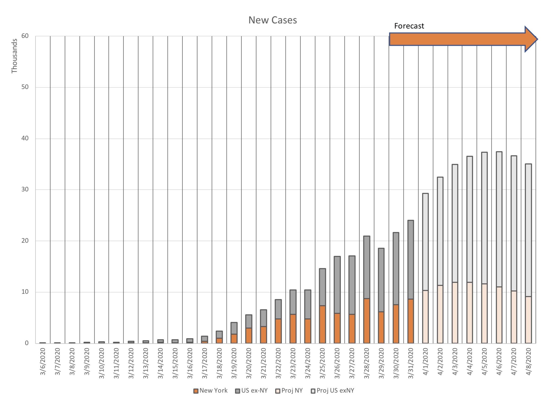
As of today, April 3 (data through 4/2), the forecasts of “new cases” are looking good. New York is trending significantly under my forecast, while “U.S. excluding New York” is tracking pretty well on trend.
I fear that I underestimated mortality as a percent of Total Cases. The next few days will tell.
For now I am sticking with my previous estimates, acknowledging that Cases may run on the low side (~760K) and deaths perhaps 10% above my prior estimate. I still think Total New Cases will peak midweek (around April 8).
The graphs below show data updated through April 2, along with my original forecasts. Thank you for reading. SM]
If you’re like me, the press conferences and the resulting press coverage leave a lot of confusion about what to expect as the pandemic plays out. Stories and headlines like this one seem to miss the point completely:
White House projects 100K to 240K coronavirus deaths as Trump tells US to prepare for ‘very painful two weeks’
I saw that press conference too, and that wasn’t my conclusion. The “100 K to 240 K” model seemed like more of a cartoon that has not changed for weeks. Dr. Deborah Birx used a graph from this model that leads to a different projection: 84,000 deaths, with a confidence interval from 38,000 to 155,000 deaths. [Note: The study’s projections have been revised upward about 10% since yesterday.]
So what should we expect? When is this thing going to peak? When will things start to get back to normal?
I decided to look at the numbers myself, and I feel marginally better. See Page 2…
BIG DISCLAIMER: I’m an engineer, a numbers guy, not an epidemiologist. This analysis carries no guarantees. I agree that we are in for a very painful two weeks. Don’t think for a minute that I’m advocating for an end to all the measures to contain the spread.
My data source was the New York Times compilation of state data at github.com. It contains cumulative cases and deaths by state. (They have one by county too, if you’re so inclined.) The data run about a day behind, so on Monday I downloaded data through Sunday, March 29, and attempted a forecast.
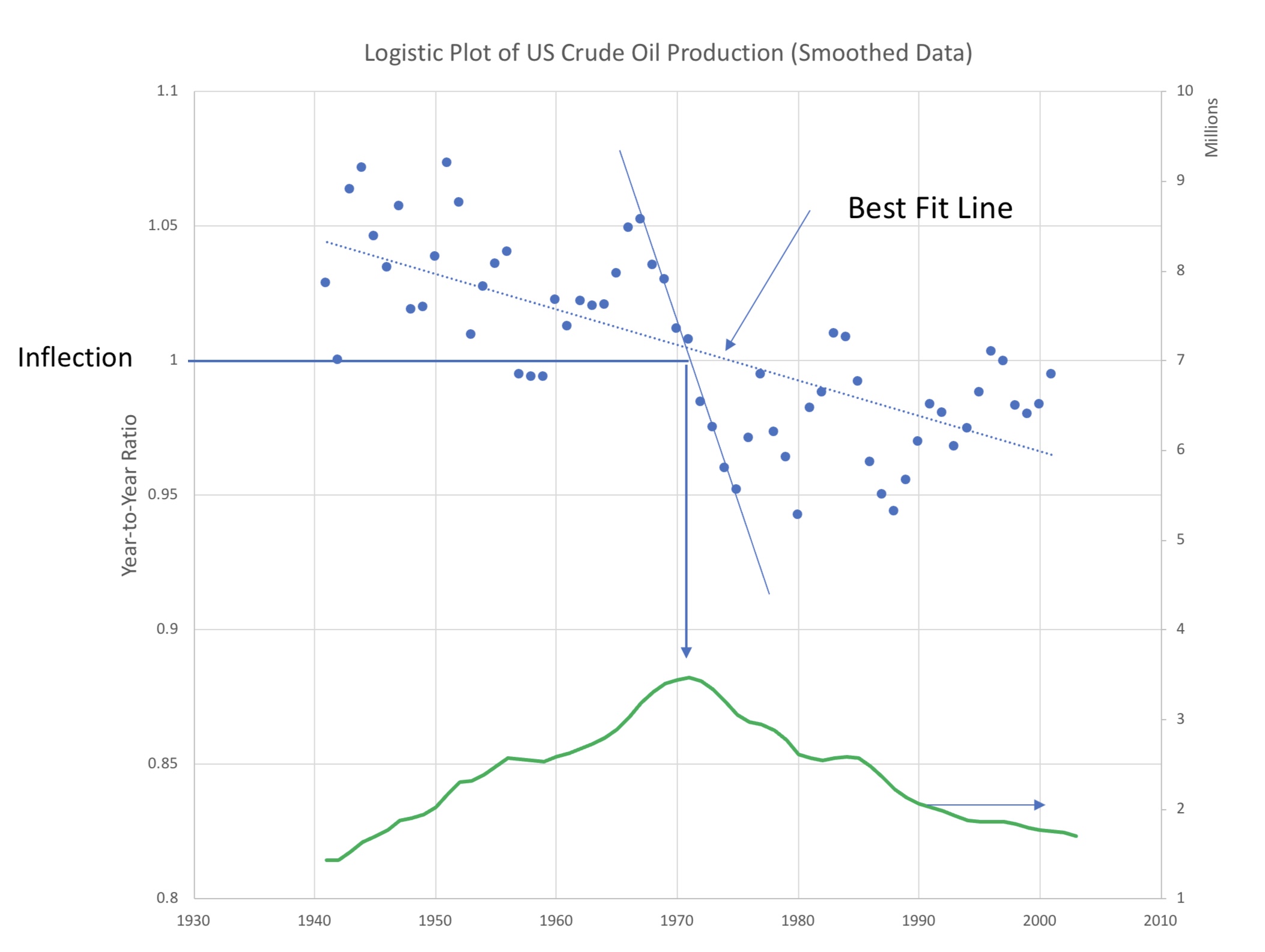
My study was heavily influenced by a video which describes the math of a “logistics plot”. It had been suggested by a work colleague of mine.
In a nutshell, an epidemic can grow exponentially, but not without limit. Ultimately, a plot of new cases will reach a peak then start to decline. The peak or plateau is called the “inflection point”; at that point new cases flatten out and start to decline. In mathematical terms, the slope of the curve is positive while increasing, then zero at the inflection, then negative on the decline.
But the data are noisy and inconsistent and may even be influenced by the day of the week. In its simplest terms, the video suggests taking the ratio of “today’s new cases” to “yesterday’s new cases”. We’ll call that the Growth Ratio.
When the Growth Ratio is bigger than 1.0, “New Cases” is still growing.
If Growth Ratio is less than 1.0, “New Cases” are on the decline.
The strategy is to plot Growth Ratio as a time series to project when it passes through 1.0. That should be the peak of New Cases.

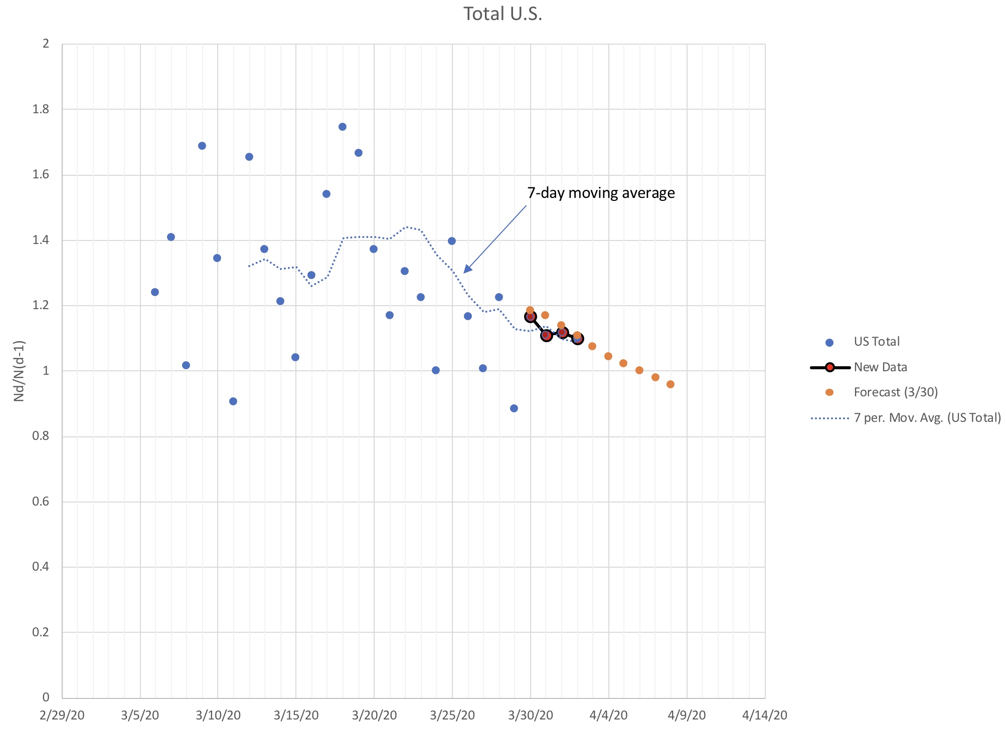


Through two days of actual data, my Monday forecast looks pretty good. I’d expect the trends to hold, barring sudden new hot spots. Tracking the daily data will tell early on if that is the case.

A key to the logistic plot is that roughly half of the cumulative is before the inflection point, half after. With a projection of cumulative cases to the peak, we should be able to make a decent estimate of the ultimate number of cases.
Through March 31, there are about 188,000 positive cases of the virus, and 3,910 deaths in the U.S. These projections suggest that the ultimate number of cases will be about 855,000. That’s about 655,000 cases in our future — a pretty scary number.
Mortality is harder to predict. At any given time, the ratio of deaths to total cases is about 1.5%, and originally I used that number. As Dr. Birx explained, though, deaths lag new cases, peaking some time after. I have no basis to pick one number over the other; I recall that early on the lethality of the virus was estimated to be in the range of about 3%. I decided to use that number, against the number of future cases. Including the cumulative deaths recorded to date, that would indicate an ultimate death toll in the U.S. of about 24,000. I’d say that number had quite a large error bar.
Overall, these projections agree pretty well in timing with the lower range of projections in the IHME model linked in the second paragraph. My estimate of deaths is sobering indeed, but would be a significant improvement over the IHME’s “best case” of over 40,000.
Most of that will happen this month. This year, even April Fool’s Day has been cancelled.
Some might say that my estimate is naively optimistic, and that projections should be left to the epidemiologists. I prefer to think of it as a prayerful objective. We can do this. We have influenced the curves. Please, y’all, just keep up with the distancing and the couch surfing.
Note: I will happily entertain any comments and corrections. It is my intention to update these curves as new data comes available.
